If you were to determine the “strongest” military power in the world and display it on a map, what factors would you consider? Would you think about the size of the force, both the number of active duty and reserve soldiers, and their global reach? Or would you think about how much the country spends on their military budget? Maps influence our perceptions of the world because it is hard to provide a comprehensible map that takes into account every variable. Maps can look completely different based on what data is displayed. To prove this, I looked into different maps and statistics on military power around the world. The specific factors I looked into were military budget, troop size, and nuclear weapons.
When looking specifically at how much countries spend in total on their military budgets, the United States spends the most. The United States military budget in 2017 was $596 billion. This is higher than the next seven countries combined. The second highest budget was China at $215 billion, less than half of the United States. Figure 1displays the map of the world based on total military expenditure. As you can see, the United States stands out. If you were to look solely at this map, you would probably assume the United States has the most powerful military. On the other hand, you could still look at budgets but create a map of the military expenditures as a percentage of the county’s GDP. This would provide a more relative comparison between the countries military spending because it is based off of their total value of goods produced and services provided during a year. Looking at military expenditures as a percent of GDP heavily alters the map view. As you can see inFigure 2, Russia now appears to be spending the most and the United States is in the middle. Looking at this map would probably lead you to believe that Russia is the strongest military power. Even though both maps are centered around military budgets, they provide two very different depictions. These two maps show how the slightest change in focus can alter the overall message and view you have on the world.
 |
| Figure 1 |
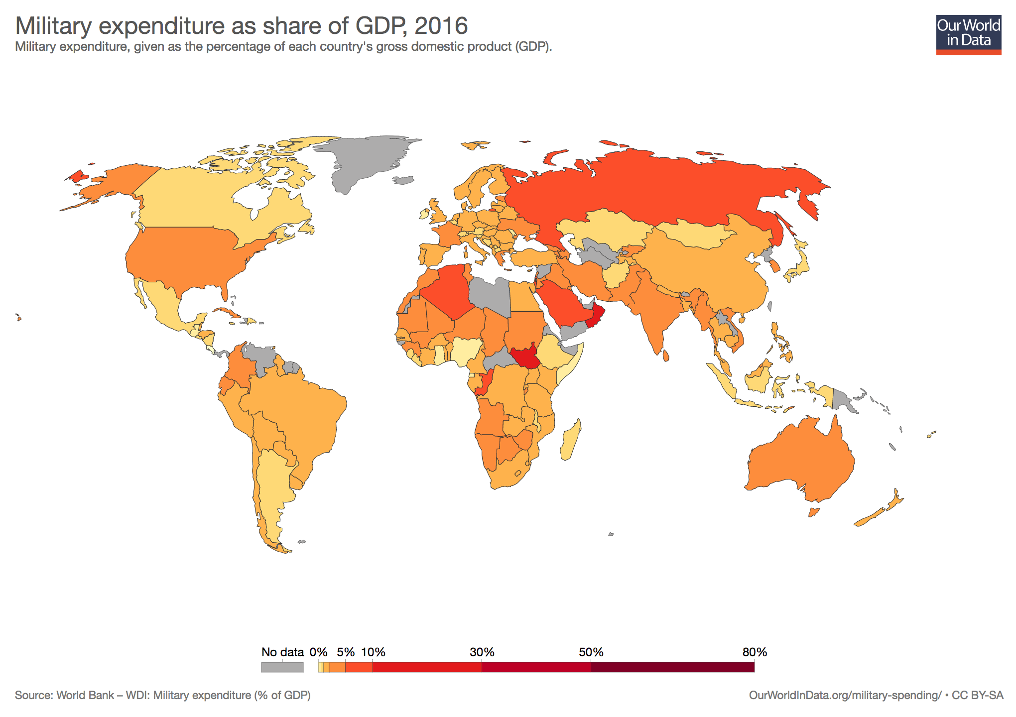 |
| Figure 2 |
The second factor I looked into to see the changes it would have on a world map was the troop sizes of the countries’ militaries. You may think that the country with the most soldiers would be the strongest due to the manpower. Based on this statistic, China has the largest military force by personnel with over two million active duty soldiers. Following behind China is India and then the United States both with a little over one million active personnel. Figure 3displays these statistics on a map. Looking solely at this map would lead someone to believe that China as the strongest Army. It provides a much different picture than the maps based on expenditures which highlighted the United States and Russia as top powers. This exemplifies how changing the data of a map can drastically change our perception on the world.
 |
| Figure 3 |
The last factor I looked into regarding military power to see the effects on a world map was nuclear weapons. Military strength could be heavily weighed on their nuclear power because of its ability of mass destruction. When looking at these statistics, Russia leads the nuclear arsenal with about seven thousand and the United States is in a close second with six thousand and eight hundred. The countries that follow behind are much lower. Figure 4displays this information on the world map. Based on this image, Russia and the United States would appear to be the “strongest” military forces with very little competition following. Once again, by changing the data of the map, the overall perception of our world view was altered.
| Figure 4 |
Someone may argue that creating maps that display different data is done to get more specific information and to learn more about that subject. I would not disagree that making multiple maps that look into different factors like budget and size can be beneficial, but I think that it often changes our perception on our overall views when seen apart or in isolation. If someone was only exposed to the map on troop size, for example, they would assume that China probably has the strongest military. It would also be hard to take all of these factors into account, deciding which are most important. One person may think how much money a country spends on its military is more important than the number of soldiers have. One of the things that stuck with me from the readings and class discussions was that maps’ power rests in the mapmaker. The person creating the map decides what factors they see as most important, and they create the map based on that. As an American, my map of military power would most likely look much different than if someone from Russia drew it.
Overall, the data of a map is very impactful. As seen through the examples, one map could look extremely different than another because it looks into a different factor. If you looked at overall budgets, the United States military would look the strongest. Slightly change the center of the map to be about spending as a percentage of GDP, and Russia would seem most powerful. Another possible factor was troop sizes and this map depicted China’s strength. Lastly, take into account nuclear weapons and see that Russia would be at the top. All of these world maps display military strength, but each image is vastly different and would change our perceptions on the world. It is very important to understand what data a map is displaying.
Comments
Post a Comment